← All work
Scanlily logo
Product Design · Scanlily

Owning the design of an AI-powered SaaS app

I led UI/UX design for Scanlily from 2022 to 2026. Scanlily is an AI-powered inventory and asset-management app, with over 10,000 users. I built the very first wireframes in Figma, and continued its design as the product grew. My job was to make powerful software feel simple to use.
Powerful software is easy to make confusing.

Scanlily does a lot. It tracks assets, containers, categories, reminders, and more. It allows you to inventory entire bookshelves with a few photos. It uses AI to correctly answer questions like “Do I have a 300 page mystery novel?” or “Do I have something to remove a grass stain from denim?”

Early ideas for Scanlily put all of the app’s powerful features in front of the user at once. The hard part was deciding what people see first, and what waits until they need it.

I led the design from first wireframe to shipped app.

I created clickable prototypes, then partnered with the engineering team to turn what I found into the interface people use today.

Core actions belong in front of you, not buried in a menu.

The developers planned to tuck advanced tools into a "flower" menu in the bottom corner. My user conversations showed the problem with that: people couldn't find the actions they used most. I moved the essential tools into a persistent top menu. The things people do every day are now one tap away.

The design earned its simplicity over time.

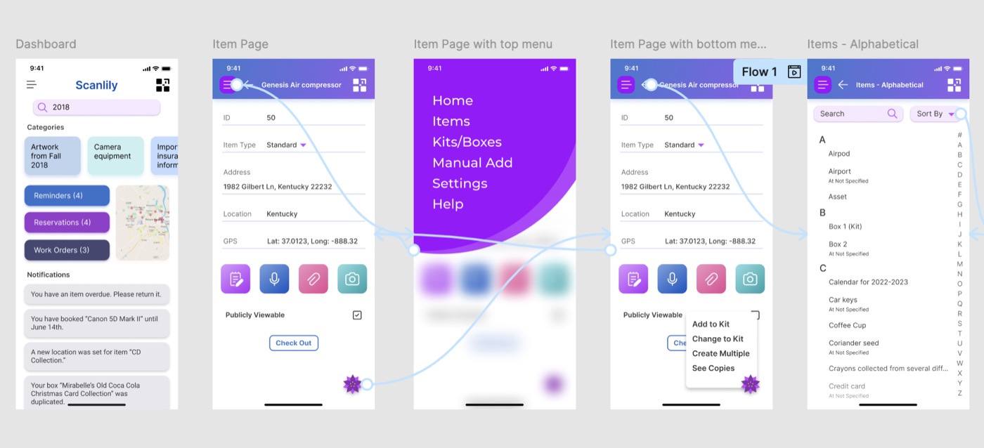
2022 Figma prototype: five screens showing the dashboard, item page, item page with top menu, item page with bottom menu, and the alphabetical items list. Click to enlarge.
My first Figma prototype, from 2022. It held far more than the app needed. I cut and reorganized these features as I learned how people actually used Scanlily.
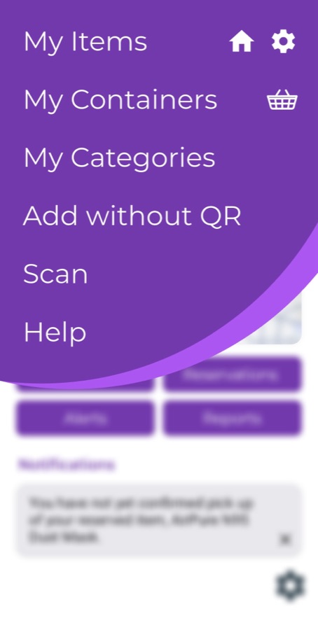
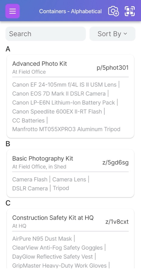
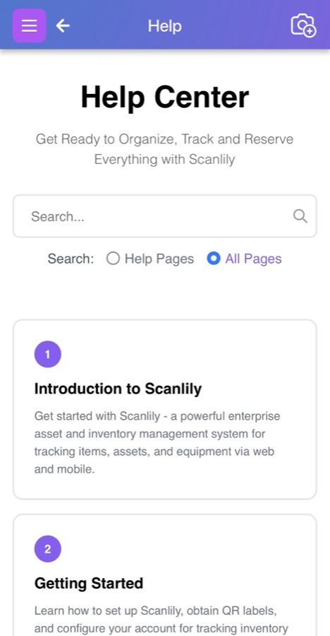
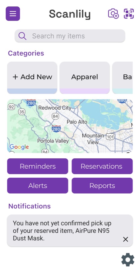
My Items dashboard, with search, categories, a map, and quick-action buttons. The app's main menu: My Items, My Containers, My Categories, Add without QR, Scan, and Help. Containers, listed alphabetically, each showing its contents and location. The Help Center, with search and a numbered list of getting-started articles.
The app today. The most-used tools sit within reach, and complex features live in the top menu instead of the bottom flower menu the team first planned.

Over 10,000 people use Scanlily.

10,000+
Users of the shipped app
A screen recording from the Scanlily Basics video series: the app's dashboard on the left, with the presenter on camera explaining it on the right.

Beyond the app, I scripted and edited the Scanlily Basics video series, illustrated the website, and designed the original Scanlily Label Packs for their physical products.

A row of illustrated cameras, part of the original artwork created for Scanlily.